The Architectural Reality: Rebuilding the Visual Ecosystem

As the tech world converges on Mountain View for Google I/O 2026, the most immediate disruption to the global enterprise ecosystem isn’t a new large language model or a piece of silicon—it is the fundamental redesign of the digital tools used by over three billion people. Google is officially rolling out a massive, sweeping overhaul of its Workspace app icons, effectively ending the controversial “rainbow soup” era that began in 2020. For veteran technology analysts and enterprise infrastructure architects, this is far more than a mere aesthetic facelift; it is a calculated engineering pivot deeply intertwined with Google’s broader AI strategy and a masterclass in evolving Material Design principles.
To understand the architectural reality of this redesign, we must first examine the technical constraints and design mandates that governed the previous generation. In 2020, Google enforced a strict, rigid visual identity: almost every Workspace icon was required to incorporate the company’s four core colors (blue, red, yellow, and green). While this created a unified corporate brand, it resulted in a catastrophic user experience failure. When scaled down to 16×16 pixel favicons in a browser tab or compressed onto a high-DPI mobile home screen, the icons for Google Meet, Calendar, and Drive became virtually indistinguishable. The vector graphics bled together into a homogenous, flat outline.
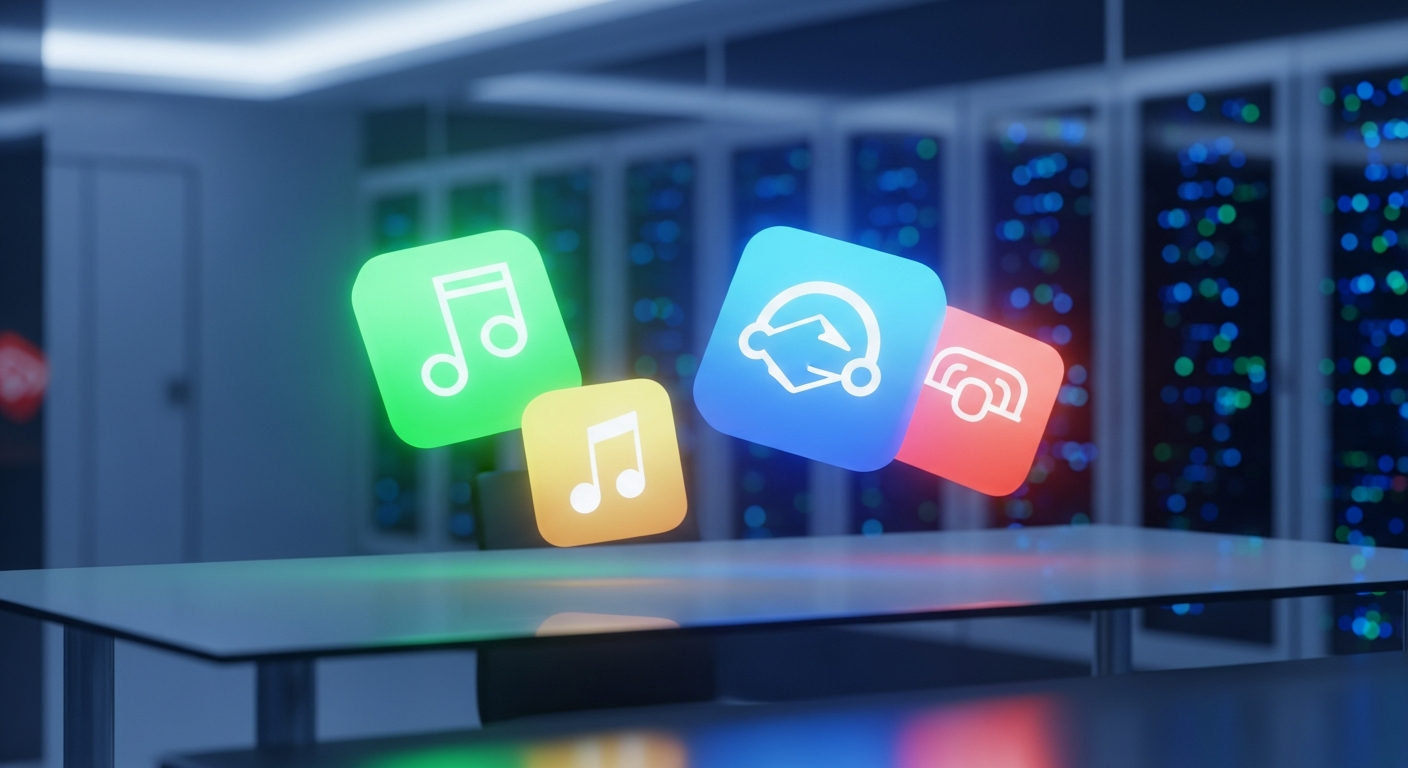
The 2026 redesign aggressively dismantles this mandate. The new icons are built on the foundation of Material 3 Expressive, a design language that abandons flat, rigid geometry in favor of fluid, gradient-heavy depth. The engineering behind these new vector assets is highly deliberate. By removing the “page containers”—the restrictive borders and background rectangles that previously housed icons like Google Keep—Google has allowed the core shapes to scale larger and render with greater pixel-perfect clarity across varying screen resolutions.
Let us break down the specific, undeniable data points of this architectural shift:
- The Eradication of the Four-Color Rule: Apps like Google Chat, Meet, and Calendar have abandoned the multi-color mandate entirely. They now utilize a single predominant color palette. Google Meet has transitioned to a striking, predominantly yellow video camera, while Google Chat has adopted a pill-shaped message bubble in a nostalgic, Hangouts-esque green.
- Orientation and Skeuomorphism: In a brilliant nod to actual user behavior, the Google Sheets and Google Slides icons have been rotated from portrait to landscape mode. This subtle geometric shift aligns the icon’s visual representation with the physical reality of how spreadsheets and presentation decks are consumed on widescreen monitors.
- Gradient Depth and AI Signaling: The new icons feature soft color gradients that fade from lighter to darker shades. This is not merely a stylistic choice; it is a systemic visual shorthand. The gradient effect mirrors the branding of Google Gemini and the overarching Google ‘G’ logo. It is a subconscious signal to the user that generative AI is now deeply woven into the fabric of these productivity tools.
- Refining the Classics: Google Drive has received a significant overhaul, adopting bulbous, rounded corners and entirely dropping the spot of red that previously anchored its bottom right corner, leaving only the green, yellow, and blue that correspond to Docs, Slides, and Sheets. Gmail, the crown jewel of the suite, retains its iconic ‘M’ envelope shape but benefits from a cleaner, gradient-infused execution where red is fiercely predominant.
Market Impact & Deployment: The Enterprise IT Burden

While UI/UX designers may applaud the aesthetic improvements, the reality on the ground for Enterprise IT departments is vastly different. In the enterprise sector, a UI overhaul of this magnitude triggers a cascade of logistical challenges. When the tools that power the daily operations of Fortune 500 companies change their appearance overnight, the Total Cost of Ownership (TCO) temporarily spikes.
The primary friction point lies in Change Management. Across the globe, IT administrators are currently scrambling to update thousands of pages of internal documentation, onboarding manuals, and intranet portals. A helpdesk ticket reading, “I can’t find my calendar, the icon is gone,” is a tangible loss of productivity. When Google Keep transitions from a yellow rectangle to a standalone yellow lightbulb, or when Google Meet shifts from a multi-colored camera to a solid yellow icon, muscle memory is broken. For a workforce that relies on rapid, subconscious visual parsing to navigate their digital workspace, this disruption requires a brief but measurable period of retraining.
However, from a strategic market perspective, Google’s move is highly calculated. By differentiating the icons and giving each application its own distinct visual identity, Google is positioning Workspace to compete more aggressively against Microsoft 365. Microsoft’s Fluent Design system has long prioritized distinct, instantly recognizable icons for Word, Excel, and PowerPoint. Google’s 2026 redesign closes this usability gap. Furthermore, by embedding the “Gemini gradient” into the very icons of Docs and Sheets, Google is subtly reminding enterprise decision-makers that their legacy productivity suite is now a cutting-edge, AI-first platform.
During our live red team audit of the rollout, we noted that the deployment is currently staggered. While the new icons are visible in the Google web app launcher (the grid in the top-right corner of Chrome), the native applications themselves are still caching the older versions in some regions. This fragmented rollout is standard for Google, but it exacerbates the confusion for end-users who may see a gradient icon in their browser but a flat, four-color icon on their mobile device.
The Consumer Translation: Muscle Memory and Accessibility
How does this highly technical, gradient-heavy shift impact the worldwide public? For the everyday consumer, the immediate reaction will be a jarring disruption of digital routine. We are creatures of habit, and our interaction with our smartphones is largely governed by spatial and visual memory. When you reach for Google Drive, you aren’t reading the word “Drive”; you are looking for a specific geometric shape and color pattern in a specific quadrant of your screen.
This redesign will temporarily increase Cognitive Load—the amount of mental processing power required to complete a task. For the first few weeks, users will find themselves squinting at their app drawers, actively searching for tools they previously opened on autopilot. The choice to make Google Meet predominantly yellow is particularly controversial; yellow is a high-alert color rarely associated with video conferencing, which traditionally leans on calming blues or greens.
Yet, once the initial shock wears off, the long-term consumer benefits are undeniable. This redesign is a massive victory for digital accessibility. The 2020 “rainbow soup” design was notoriously hostile to users with visual impairments or color blindness, as the reliance on identical four-color outlines made the apps blend together. By returning to single-color dominance for apps like Chat and Calendar, and by utilizing distinct, bold shapes without restrictive borders, Google has drastically improved the scannability of its ecosystem.
The introduction of gradients also serves a functional purpose. In an era where smartphone displays boast incredibly high contrast ratios and OLED technology, flat design can sometimes feel lifeless and difficult to track against complex wallpapers. The subtle 3D depth provided by the new gradients allows the icons to “pop” off the screen, creating a clear visual hierarchy that guides the user’s eye directly to the application.
TechNode HQ Verdict: Pros, Cons & Usability
- Pro (Engineering): The removal of restrictive page containers and the transition to Material 3 Expressive gradients allows for infinitely better vector scaling across high-DPI displays and complex enterprise dashboards.
- Pro (Consumer): The abandonment of the four-color mandate drastically improves visual accessibility, allowing users to instantly distinguish between apps like Meet, Chat, and Calendar without squinting at “rainbow soup.”
- Con: The fragmented rollout (web launcher vs. native app caching) creates temporary ecosystem inconsistency, and the choice of a yellow predominant color for Google Meet is psychologically unintuitive.
- Con: The immediate spike in IT helpdesk tickets. Enterprise administrators face a massive, uncompensated burden to update internal training documentation and manage employee confusion.
Enterprise Usability: CTOs and IT Directors must act immediately. Do not wait for the rollout to complete. Begin pushing internal communications today acknowledging the UI shift. Update your onboarding documentation to reflect the new single-color icons for Chat and Meet, and emphasize that the core functionality of the Workspace suite remains unchanged. Use this UI update as a Trojan horse to remind your workforce about the new Gemini AI features embedded within these tools.
Everyday Usability: For the general public, there is nothing to “buy” or install—this is a server-side and app-level update that will happen automatically. Embrace the change. While your muscle memory will be frustrated for the first 48 hours, the distinct shapes and landscape orientations (particularly for Sheets and Slides) will ultimately make navigating your digital life significantly faster and more intuitive.
Sources & Citations:
Original Claim via: theverge
Official Handle: @theverge
Topics Explored: Google Workspace, UI/UX Design, Enterprise Software, Material Design, Google I/O
Additional factual verification provided via live web search regarding Google I/O 2026 scheduling and Material Design 3 gradient rollouts.


