🔑 Key Takeaways
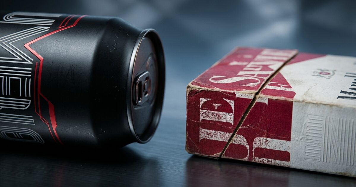
- The 2026 Coca-Cola visual refresh sparked controversy due to typographic similarities with Marlboro.
- The redesign is powered by ‘Project Fizzion’, an AI-driven brand governance system built with Adobe.
- Centralizing global design assets reduces agency TCO and accelerates time-to-market up to 10x.
- Big Soda faces regulatory scrutiny mirroring Big Tobacco’s legislative battles in the late 1990s.
- Algorithmic design intelligence currently lacks the ability to flag deep human cultural associations.
The Architectural Reality of the Coca-Cola Visual Refresh

In July 2026, The Coca-Cola Company executed what appears on the surface to be a subtle graphic update. However, the Coca-Cola visual refresh is actually the deployment of a massive, programmatic design architecture. Developed alongside branding agency JKR and packaging design studio The Superultrarare, the update seeks to create visual unification across the company’s sprawling presence in over 200 global markets. The goal is straightforward on paper: emphasize core historical assets, such as the Spencerian script, the iconic red-and-white color palette, and the Dynamic Ribbon, while establishing a stricter hierarchy for sub-brands like Coca-Cola Zero Sugar, which now features aggressive black typography and caps.
Yet, the true architectural shift is happening beneath the surface. This is not merely a PDF of new brand guidelines being emailed to regional offices. This refresh is powered by “Project Fizzion,” an ambitious AI-powered design intelligence system engineered in collaboration with Adobe. Project Fizzion fundamentally transitions brand management into the realm of Enterprise IT. By integrating directly into Adobe Creative Cloud applications like Photoshop and Illustrator, Fizzion acts as an algorithmic copilot that observes designers’ workflows and enforces mathematical consistency.
At the core of this system are “StyleIDs”—intelligent, machine-readable brand assets that dynamically adapt to different localized contexts without human intervention. Instead of relying on hundreds of fragmented local design teams to interpret a static style guide, Coca-Cola has effectively created an API for its brand identity. It is a masterclass in treating Consumer Tech aesthetics as a deployable software package, ensuring that a billboard in Tokyo strictly adheres to the exact same geometric constraints as a digital ad in New York.
Market Impact and Deployment: Evaluating the TCO of Brand Centralization
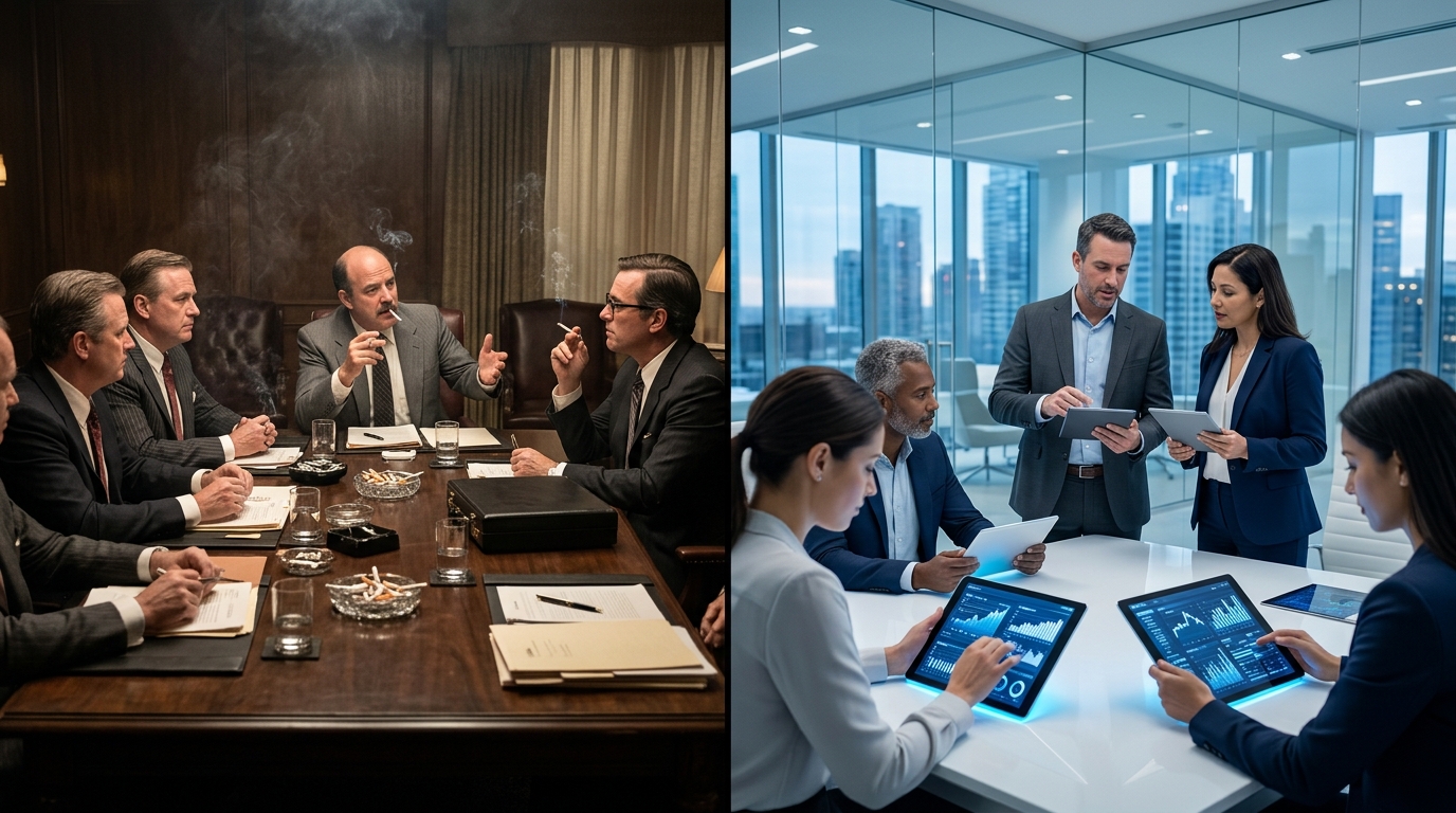
For C-suite executives and Chief Information Officers, the deployment of Project Fizzion represents a massive reduction in Total Cost of Ownership (TCO) for global marketing operations. Historically, a multinational corporation rolling out a new campaign would require vast networks of local agencies to manually adjust layouts, typography, and image cropping to suit regional dimensions and languages. This manual process is notoriously slow, heavily prone to human error, and exceptionally expensive.
By leveraging AI Machine Learning models to handle the repetitive, tedious aspects of localization, Coca-Cola claims its creative teams can produce localized campaign variations up to ten times faster. This level of automation drastically cuts agency billable hours. The AI handles the “boring” mathematical scaling of the Dynamic Ribbon and the precise spacing of the Spencerian script, allowing human designers to focus on high-level strategic ideation rather than pixel-pushing.
However, deploying a centralized AI design system at this scale is not without its friction points. Governance models must be rigidly maintained. The algorithmic enforcement of design means that any underlying flaw in the central model will propagate globally at unprecedented speeds. While Arnab Roy, Coca-Cola’s Global Brand Head, emphasized that the refresh is about “being clearer and more consistent in how we show up,” that very consistency ensures that any visual missteps are instantly magnified across the entire world, leading directly to the most critical failure point of the 2026 rollout.
The Consumer Translation: When Algorithms Miss Cultural Context
When the new 90-second video announcing the visual refresh went live, social media users did not praise the geometric perfection of the StyleIDs or the efficiency of Project Fizzion. Instead, they had a visceral, immediate reaction to the typography. The internet collectively observed that the new font styling bore a striking, undeniable resemblance to Marlboro, the most popular cigarette brand in the world.
While design experts, including designer Andreas Storm, quickly pointed out that the typeface used by Coca-Cola is technically distinct from Marlboro’s proprietary font, this technicality is irrelevant to human perception. Human brains process visual information through semiotics and cultural memory. The heavy, condensed styling of the text, combined with the dominant red-and-white color palette, instantly triggered the cultural engrams associated with Philip Morris’s flagship product. One viral post summarized the sentiment perfectly: “Love that they just leaned into the fact that soda is the new cigarettes by just straight up doing the Marlboro font.”
This reveals a glaring blind spot in algorithmic design intelligence. Systems like Project Fizzion excel at mathematical layout, color theory adherence, and asset generation. What they completely lack is the historical, sociological, and cultural context of human history. An AI cannot look at a font choice and intuitively feel the cultural weight of a 1990s cancer-causing consumer product. It requires human red-teaming to spot these toxic associations, and in the pursuit of automated efficiency, Coca-Cola’s highly paid human executives and agencies seemingly missed the forest for the trees.
Regulatory Parallels: Is Soda the New Tobacco?
The comparison to Marlboro is not just a quirky internet meme; it is a profound corporate risk. For decades, Big Tobacco spent exorbitant sums to embed its brands into the cultural zeitgeist. In the 1980s, Brown & Williamson paid to feature their products in movies like Ghostbusters and signed a $500,000 contract with Sylvester Stallone to smoke on screen. But by the late 1990s, the legal and cultural landscape shifted violently. States sued to recoup healthcare costs, marketing to minors was banned, and the product became fundamentally toxic. Adult smoking rates plummeted from 42% in 1965 to just 11% by 2022. The toxicity was so severe that Philip Morris’s corporate parent chose to rebrand itself entirely to the Altria Group to escape the stigma.
Today, Big Soda finds itself in a terrifyingly similar regulatory crosshair. Sugary drinks are increasingly blamed for the global crises of obesity and diabetes. Public health campaigns are actively pushing to remove these products from schools, levy sugar taxes, and restrict advertising access to minors. The media frequently poses the question: Is sugar the new tobacco? In this highly charged legislative environment, looking like a cigarette brand is an unforced error of epic proportions.
Coca-Cola is fighting massive public relations battles to distance itself from the stigma of being a public health hazard. Associating your flagship product with the world’s most recognizable emblem of lung cancer, however unintentional the typography choice may have been, undermines millions of dollars of lobbying and health-conscious marketing. It is a stark reminder that as enterprises rush to hand over the keys of their brand identity to AI copilots, the consequences of a culturally tone-deaf deployment can threaten the very foundation of a multi-billion dollar empire.
Frequently Asked Questions
Q1: What is the Coca-Cola visual refresh for 2026?
A1: The Coca-Cola visual refresh is a global redesign aimed at unifying the brand across over 200 markets, focusing on core assets like the Spencerian script and the red-and-white palette.
Q2: Why are people comparing the new Coca-Cola design to Marlboro?
A2: Social media users noticed that the new typography and visual aesthetic share semiotic similarities with Marlboro’s iconic packaging, though designers confirm they are technically different typefaces.
Q3: What technology is powering Coca-Cola’s new brand identity?
A3: Coca-Cola is utilizing an immersive Brand Center and AI-powered Design Intelligence tools, known as Project Fizzion, developed in partnership with Adobe.
Q4: What is the business value of this centralized design system?
A4: By using AI tools like Project Fizzion, Coca-Cola reduces Total Cost of Ownership (TCO) by generating campaign variations up to 10x faster and minimizing redundant localization spend.
TechNode HQ Verdict: Pros, Cons & Usability
- Pro (Engineering): Deep integration with Adobe via Project Fizzion creates a machine-readable, API-driven brand governance system that guarantees exact geometric consistency.
- Pro (Consumer): Highly unified visual recognition across all global markets, reducing cognitive load when identifying product sub-tiers like Zero Sugar.
- Con: Algorithmic design currently lacks the cultural safety checks necessary to prevent catastrophic visual associations with toxic historical brands.
- Con: Deploying changes globally via automation means that design errors or public relations missteps are propagated instantly across 200+ markets without manual intervention buffers.
Enterprise Usability: For CTOs and CMOs, deploying an AI-driven brand architecture like Project Fizzion is the future of reducing agency TCO. However, enterprises must mandate “human-in-the-loop” cultural audits before pushing dynamic StyleIDs to production to prevent reputational damage.
Everyday Usability: The public will continue to purchase the product unaffected by the backend technology, but the subliminal association with tobacco proves that consumers remain highly sensitive to subtle semiotic shifts in the products they consume daily.